By Noah Lee
Your vehicle details page (VDP) is where customers are most likely to take action: fill out a form, call your store, start a deal, or even come into the dealership. Your VDP, where customers take the next step in buying a car from you, is also often where shoppers become dealer leads.
With so much at stake on VDPs, it is critical to nail the user experience. If you don’t, customer action can become inaction, and your flexible buying experience can suffer.
Use (Real) Big Photos
When I say real big photos, I mean recent photos of the actual vehicle being sold that are also high quality. Remember, customers like to see photos of the car they’re looking to buy. Give them high-resolution photos that help them see each vehicle in detail. With these photos, auto sales leads tend to stay on your VDP longer and view more VDPs than they otherwise would with stock photos. Moreover, real images increase the likelihood of getting a lead by 30% for new vehicles and 40% for used ones.1
Remove Brand Overlays
Real estate on the VDP is limited, especially on mobile. Your branding (as amazing as it may be) can distract from the car and frustrate shoppers. Plus, overlays featuring the dealership name and contact information are often redundant with information already displayed elsewhere on screen.
From a practical point of view, a page with multiple branded vehicle photos side-by-side can feel cluttered and be hard to scan. If you must brand photos, keep it limited to the first photo, and remove it from the rest.
Include Detailed Incentives and Discounts
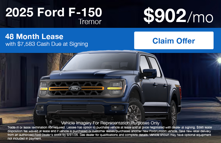
This is the moment you’ve been waiting for. It’s time to talk terms. Up until now, your customers haven’t had a chance to look at pricing in detail. But your VDP is the perfect place to show detailed pricing.
Not only does detailed pricing on the VDP help assure apprehensive shoppers, but it can also pique their interest and keep shoppers focused. Break out all your incentives and discounts in your pricing stack. And be detailed, since this is where car shoppers spend most of their time.
Be as transparent as you can be with your pricing. If you’re willing to go low, show that price! If your OEM won’t allow you to display pricing below invoice without a customer’s information, utilize an instant ePrice tool that will capture those details and unlock that low price for all your vehicles. You’ll be providing a great service to your customers while keeping your OEM happy.
Create Clear Calls to Action
The benefits of a clear call to action go beyond improved dealer lead rates. It also helps create a positive brand perception. Design calls to action with high contrast and limit them to two to three options. Having too many calls to action actually decreases your conversion rate.
Give context to your calls to action, like placing pricing CTAs next to the final price on the VDP, for example. And always order calls to action on the page by engagement. According to Dealer.com research, for dealers featuring transparent pricing, “Confirm Availability” received the highest click through rate (4%).1 And for dealers not featuring transparent pricing, “Get Today’s Price” received the highest click through rate at 8.2%, “Get Our Price” received 7.3%, “Get Your Price” received 6.0%, and “Get ePrice” got 5.7%.1
The majority of these VDP best practices are already baked into the Dealer.com automotive digital marketing platform, so you’re good to go from the start. But these are just a few of the VDP best practices that you can implement on your digital storefront.
To learn other great ways to improve your website performance or to book a demo, click here.
1 The Data That Drives Good Design White Paper, August 2020


