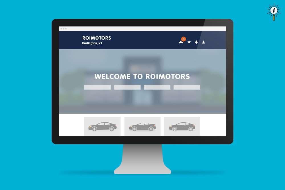
Dealer.com is committed to keeping our website platform modern, fresh, and optimized for today’s consumer.
As we update and streamline the architectural framework of our website platform to better serve our clients and today’s automotive shopper, we are pleased to announce the release of several new design enhancements. These subtle yet important changes are aligned to website design best practices and are being implemented to improve website performance, align with the upcoming launch of our new Vehicle Deals Page, and comply with the Americans with Disabilities Act.
More flexibility, improved contrast and better engagement on your buttons and calls-to-action.
We’ve restyled buttons to ensure they are clearly identifiable across a range of calls-to-action. This update provides more consistency in how we communicate information that is relevant to users.
Before
After
Standardized Background and Foreground Colors
We’ve streamlined foreground and background colors to increase contrast when appropriate, to support users with vision or color deficiencies. This update complies with Web Content Accessibility Guidelines and makes text easier to read.
Additional Adjustments
—Additional adjustments were made to standardize navigation colors across desktop and mobile experiences to ensure continuity across devices.
—We also standardized arrow icons in navigation, form dropdowns, slideshows, and made minor spacing adjustments to improve readability and design clarity across the website.
Much More to Come
Our engineering teams are continuously developing new enhancements to your digital marketing platform. To stay informed on all the new features and benefits, please subscribe to our Insights Center. If you have any questions about these changes, please contact your Digital Strategist or call Dealer.com Support.
Thank you for your partnership!


